The communication of BOREA and its products evolves !
Published on 31st March 2021
In order to revitalize the communication of our company as well as in a continuous desire to improve our brand image, we have adapted our different logos.
BOREA the shade company
Digital and modern are two words that perfectly define our new identity.
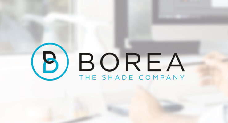
This rebranding starts with a new BOREA logo that has been refined to make it simpler and more impactful. Sober and modern, it has been thought around two main colors:
- White, which represents the chromatic synthesis of all visible wavelengths (colors), also perceived as a symbol of unity and perfect balance.
- The blue, cyan slightly greenish, symbolizes the medical field and innovation.
This is accompanied by two interlocking markers that form the Borea "B" monogram, which is embedded in a protective circle.
Finally, we added a baseline to our logo that highlights Borea's core business in the dental field: shade.
Rayplicker becomes Rayplicker Handy
The shade-taking device you know remains the same. However, its name and the graphic charter that accompanies it are evolving as Rayplicker becomes Rayplicker Handy.
Its logo is also evolving, taking on similar characteristics to the company's one. As you can see, the font and the colors are the same as for the BOREA logo, in a wish of consistency of our brand image.